

Picking an outfit for a wedding is already a lot. Now add one more layer: choosing colors that look good in real life and in photos. Because let’s be honest, some colors feel amazing in a mirror and then look… questionable under bright lights or camera flash. Suddenly the “soft blush” reads beige. The “bold red” turns neon. And black can look flat if the lighting is harsh.
That’s why wedding color palette fashion matters. It’s not about following rules or matching every single person in the bridal party. It’s about choosing shades that work with the setting, the lighting, and the way cameras actually see color.
This guide breaks it down in simple terms, with practical checks that save people from last-minute outfit panic.
Before diving into specific shades, a few basics make everything simpler. First, think about the venue palette. Not because anyone needs to match the decor, but because photos will include it. A beach wedding has lots of sand and sky tones. A ballroom might have warm gold lighting. A garden venue is all green, all day.
Second, consider timing. Daytime weddings handle pastels well. Evening weddings love deeper tones and richer textures. Third, think about skin undertones. Not in a “rules” way. In a “this will make someone glow” way. Some shades brighten skin, others drain it.
This is where outfit color coordination starts. It’s a mix of environment, timing, and the person wearing it.
Cameras don’t see color the way eyes do. Skin undertones, lighting temperature, and background colors all affect how an outfit shows up.
Here’s what usually messes things up:
So the goal isn’t just “pretty color.” The goal is color that keeps its personality in photos, even when lighting changes.
Some colors are naturally camera-friendly. They keep depth, don’t get washed out easily, and play nicely with different lighting.
Cream, champagne, taupe, warm beige, soft mocha. These look elegant and photograph cleanly, especially if the fabric has texture. Flat fabrics in pale neutrals can look boring on camera, so the material matters.
A satin champagne dress will photograph better than a thin, flat beige. Same color family, different impact.
Dusty rose, muted mauve, soft sage, smoky lavender, pale terracotta. These are popular for a reason. They look romantic but still have enough pigment to show up clearly in photos.
They’re also easier to coordinate across a group. Everyone can wear a slightly different dusty tone and still look cohesive.
Emerald, sapphire, deep plum, burgundy, rich teal. Jewel tones are reliable for evening weddings and indoor venues because they hold color under warm lighting. If someone wants to look polished and confident without trying too hard, jewel tones usually deliver.
Navy, charcoal, chocolate brown, deep olive. These are good alternatives to black, especially for photos. Black can look flat if there’s not enough texture or contrast. Deep neutrals keep the sophistication but photograph with more dimension.
This is one of the most helpful pieces of fashion color advice: if black feels too harsh, go deep navy or charcoal and the photos will look softer.
No color is “bad,” but some are harder to pull off without extra thought.
Neons can dominate photos and reflect weirdly on skin. They also pop more under flash. If someone loves bright shades, a better move is going bold but slightly deeper, like a true fuchsia instead of neon pink.
Light pastels can wash out, especially in bright daylight. They can also blend into the background if the venue is light-colored. If someone wants pastel, choose one with a slightly dusty or muted tone, or add contrast with accessories.
White is risky because it can compete with bridal looks and also overexpose in photos. If someone wants a light outfit, go with soft colors like blush, champagne, light blue, or sage.
Venue matters more than people think. The same outfit can look amazing in one setting and strange in another.
Greens and earthy tones look natural here. So do dusty pinks and soft blues. Bright green can blend into the background, so a deep emerald works better than a fresh spring green.
Soft blues, seafoam tones, sandy neutrals, and warm pinks work well. Super dark colors can look heavy unless it’s an evening beach ceremony.
Richer colors shine here. Jewel tones, metallics, deep neutrals, and strong classic shades like wine or navy photograph beautifully under indoor lighting. This is what a good style palette guide does. It matches the mood of the space instead of fighting it.
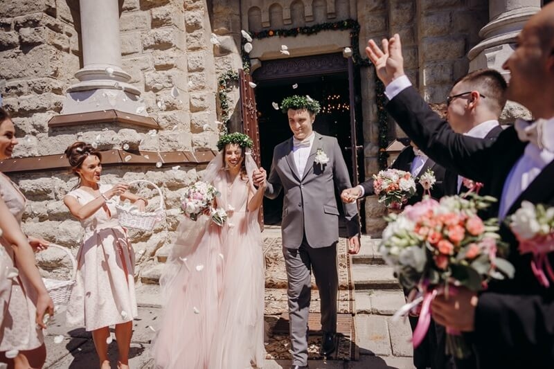
Coordination doesn’t mean everyone wears the same shade. It means the group looks intentional in photos.
Try these approaches:
For example: navy, dusty blue, and champagne. Or emerald, soft sage, and gold. Or terracotta, sand, and muted rose. That’s real outfit harmony. It feels put together without feeling forced.
Color is not just color. Fabric changes how color reads. A matte fabric looks different from satin. Velvet absorbs light. Sequins reflect it.
Here’s a simple rule:
If someone loves a color but it looks too loud, switching to a matte fabric can calm it down. If a color looks too flat, a slight sheen can make it feel alive.
No one wants surprises. These quick checks help.
Stand in a dim room and take a flash photo. If the color washes out, reflects too much, or looks odd against skin, adjust.
Take a photo in natural daylight. Bright colors often look brighter. Pastels often look lighter. This shows the “real wedding photo” version.
If possible, compare the outfit color to the venue vibe. If it blends into the background too much, add contrast through accessories or a wrap. These steps help people make smarter wedding color choices without relying on guesswork.
Sometimes the outfit shade is fine, but it needs balance.
Even a small detail like earrings, a clutch, or shoes can make the color story feel complete.
And yes, makeup matters too. A shade that looks great on the outfit can still look off if the makeup is too cool or too warm. A quick matching check saves a lot of “why do I look tired?” photos later.
Color choices can feel stressful because they’re permanent in photos. But the goal isn’t perfection. The goal is feeling good and looking like yourself.
The most photogenic outfits usually have three things:
That’s what wedding color palette fashion is really about. Less guessing, more clarity. And better photos, obviously.
Dusty tones, jewel tones, and deep neutrals usually photograph well in both indoor and outdoor lighting, and they keep depth on camera.
Choose a shade in the same color family, or use accessories in the palette. Coordination works best when it feels intentional, not identical.
Very pale shades can lose contrast under bright light or flash. Choosing a slightly muted pastel or adding texture helps the color show up better.
This content was created by AI